Ale Beer Visual Characteristics: Why Your IPA’s Look Determines Sales
The Digital Handshake: Buying with Your Eyes
In the past, a brewer shook hands with a customer across the bar. Today, that handshake has been digitized. Whether on a delivery app or a distributor’s portal, your beer’s thumbnail image has to do all the heavy lifting. It must communicate flavor, mouthfeel, and freshness before a single drop is consumed.
Understanding ale beer visual characteristics is no longer just for judges; it is a critical marketing survival skill. If your visual assets don't match the liquid inside the can, you risk disappointing the customer before they even take a sip.
This guide breaks down the visual physics of ales, the difference between ale and lager visuals, and why smart breweries are ditching cameras for "Digital Twins" to get the perfect shot every time.
Ale Beer Meaning: It’s All in the Yeast
To master the look, we first need to understand the biology. The ale beer meaning—biologically speaking—comes down to the yeast: Saccharomyces cerevisiae.
This yeast is a "top-fermenting" organism that thrives in warm temperatures (60°F–70°F). Because it works fast and stays active, it creates a specific set of visual rules:
- Complexity & Texture: Unlike the clean, gem-like clarity of a lager, ales often have a "living" quality. They are visually complex.
- Saturation: The warmer fermentation produces esters (fruity compounds), which often result in a beer that looks richer and more saturated.
- The "Top Crop": The yeast rises to the top during fermentation, creating a thick foam crust. This biological vigor translates into the final glass as a structured, persistent head.
Ale vs. Lager: The Visual Split
While ales are warm and fast, lagers use Saccharomyces pastorianus, a bottom-fermenting yeast that loves the cold. This cold storage ("lagering") creates a natural gravity filter, dropping everything out of suspension to create a "brilliant" (clear) liquid.
Here is the cheat sheet for the visual differences:
| Feature | Ale Characteristics | Lager Characteristics |
|---|---|---|
| Visual Archetype | Textured, Rich, Complex | Bright, Luminous, Pure |
| Clarity | Variable (often hazy/opaque) | "Brilliant" (Gem-like clarity) |
| Head Texture | Creamy, dense, or mousse-like | Rocky, effervescent, large bubbles |
| Color Perception | Saturated & Deep | Light & Reflective |
Defining Ale Beer Visual Characteristics
When marketing an ale, you aren't just showing a color; you are signaling a flavor profile. Here are the three pillars of ale beer visual characteristics you must get right.
1. Turbidity: The Haze Hype
In modern craft beer, turbidity (haze) is a massive signal. For a New England IPA (NEIPA), opacity isn't a flaw; it's a promise of "juice".
- The Glow: A hazy ale scatters light. It shouldn't look flat or muddy; it should have an "inner glow" caused by light bouncing around the suspended proteins.
- The Promise: This visual texture tells the brain "low bitterness" and "tropical fruit" instantly.
2. Foam Structure: The Cream vs. The Rock
Ale foam is different. Especially in styles like Stouts or Wheat beers, the head should look like whipped cream or meringue.
- Nitrogen: For Nitro stouts, the bubbles are microscopic, creating a cascading velvet look.
- Wheat: For Hefeweizens, the foam is tall and thick, standing above the glass rim like a crown.
3. Color Depth: The Myth of "Dark Ales"
There is a common myth that all ales are dark and all lagers are light. While not chemically true (you can have a dark lager!), consumers expect ales to look richer.
- Value Perception: Darker, more saturated colors are often psychologically linked to higher price points and higher alcohol content.
- The "Black Hole" Problem: Dark ales (Stouts/Porters) absorb light. If photographed poorly, they look like a flat black blob. They need specific lighting to reveal ruby highlights and "thick" viscosity.
The Psychology: Why Looks Matter
Your customer’s brain is judging the beer before they buy it. This is called the "Disconfirmation of Expectation" effect.
If a consumer sees a dark, opaque beer, they expect it to be sweet and full-bodied. If they drink it and it's thin and watery, they will dislike it—even if the flavor is actually good. Your visual assets must accurately predict the "rheology" (flow) and weight of the liquid.
Marketing Insight: A lager that looks hazy looks "flawed" or dirty. An ale that looks hazy looks "juicy" and premium. Context is everything.
The Problem: Cameras Hate Beer
We know what ale beer visual characteristics we need: rich texture, specific foam density, and perfect color. The problem? Traditional photography is terrible at capturing them.
1. The Physics Nightmare
Beer bottles are cylindrical mirrors. They reflect everything in the room, requiring expensive "tenting" setups.
- Haze is Hard: Backlighting a hazy IPA often makes it look like a dull silhouette because light can't punch through the particles.
- Darkness: Lighting a Stout to show texture without washing out the label requires complex compositing.
2. The Freshness Trap
Foam dies in seconds. Condensation evaporates under hot studio lights. Photographers often use shaving cream or salt to fake the foam, but customers can spot the difference—it looks stiff and artificial.
3. The "Marketing Lag"
You can't photograph the beer until it's in the bottle. This means you are shipping samples, risking breakage, and waiting weeks for photos while your fresh IPA sits in the warehouse.
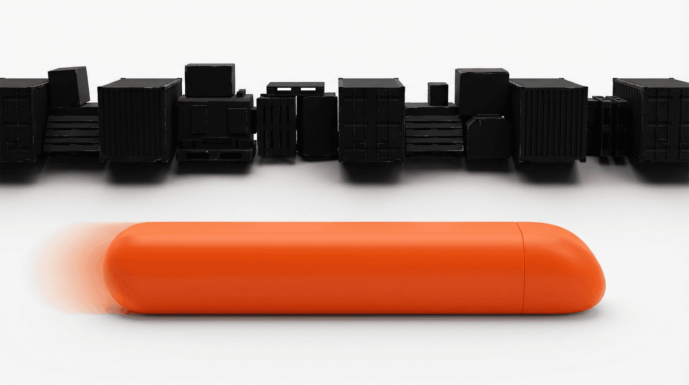
The Solution: Stop Shipping Bottles
The industry is shifting from "atoms to bits." Agencies like HoppyShots.com are using Virtual Production (CGI) to create "Digital Twins" of beer. This isn't just a photo; it's a math equation that solves the ale vs. lager visual dilemma.
1. Mathematical Precision (SRM)
Instead of hoping a photographer gets the lighting right, Virtual Production uses the Standard Reference Method (SRM) hex code.
- Need a West Coast IPA at SRM 7? It is rendered with the exact copper-gold hue of the real liquid.
- Need a Hazy IPA? We dial up the "Subsurface Scattering" to create that perfect juicy glow without the glare.
2. The Infinite Pour
In a virtual environment, foam never collapses. We can engineer the bubble structure to match the style.
- Lager Mode: Large, rocky, fizzy bubbles.
- Ale Mode: Tight, creamy, meringue-like foam.
- Digital Sweat: Condensation that looks ice-cold but never drips or evaporates.
3. The Virtual Sprint
Because we work from the label art file (PDF), we can generate these 50+ assets weeks before the beer is brewed.
- Speed: Assets delivered in 24-48 hours.
- Cost: ~€10 per image vs. €150 for traditional photos.
- Sustainability: Zero shipping means zero carbon footprint.
Conclusion
The visual difference between an ale and a lager is subtle but powerful. It communicates flavor, price, and quality. But relying on traditional photography to capture these nuances is slow, expensive, and scientifically difficult.
By switching to Virtual Production, you gain total control over the physics of your product. You can ensure your Stout looks velvety and your IPA looks juicy, all while saving money and saving the planet.